I have a little update for you folks on the Matawatchan Project that I posted about here. This is the re-built 125 year old log home that I’m working on for our good friends “A&N”.
Starting from scratch certainly has it’s benefits. With no existing walls or finishes to deal with you have the luxury of planning in all of your wants and needs. But that doesn’t mean that there aren’t still issues to deal with. With this open floor plan, there are structural supports, staircases and the natural log walls to deal with, among others. I should also share at this point that this home is OFF THE GRID. That’s right – we’re talking SOLAR powered – how cool is that? So in order to keep energy consumption low “A&N” want to keep interior walls to an absolute minimum to make maximum use of the light from each window.
First up was the kitchen floor plan that I posted about here. To refresh your memories - here is a picture of the kitchen as it sits today. The kitchen will take up the space between the staircase to the far interior wall for the powder room and from the wall with the clock to the two jack-posts in the foreground.
The list from “A&N” was simple, your usual kitchen stuff - well mostly…
- standard sized appliances (fridge, gas stove, dishwasher)
- island for gathering around
- corner sink looking out over the countryside while doing the dishes
- storage and more storage
- a dumbwaiter – yep – a dumbwaiter (the back entrance is in the basement and any supplies can be brought upstairs via the dumbwaiter – neat huh?)
My job was to fit as much of this in as I could, while considering kitchen standards on traffic patterns, distances and working triangles, al the while making sure there was some pizzazz!
So after some kitchen planning research, learning the CAD product I posted about here, a couple of iterations with “A&N” – which included switching the direction of the staircase - here is the plan that we are currently finalizing: 
We were able to fit in most requirements, but the island wasn’t feasible. Instead I’ve proposed a long stretch of cabinets and counter that house the gas stove and have a raised countertop for pulling up a stool to chat with the cook as they are preparing meals. Base cabinets will be a combination of drawers and doors. I’ve also opted for no uppers on the log walls – they will block the light from the windows. The one interior wall along the staircase will have uppers and we’ll use open shelving on the log walls between the two windows.
One of my concerns was the powder room being right beside the kitchen counter, so since “A” does some very creative and beautiful stained glass, I’ve suggested that she hang a piece from ceiling to counter to visually continue the powder room wall, while still allowing light to filter from the opposite window.
We’ve discussed some finishes and are thinking of Caesarstone for countertops – maybe something like this
(Shaded White # 6600)
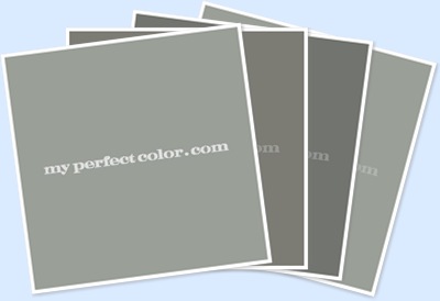
painted base cabinets in a nice medium gray with a hint of blue something like these
(BM 1635 – Waters Edge, BM HC145 – Van Courtland Blue, SW7624 – Slate Tile, SW1223 – Steel Blue)
Uppers on the interior wall in a white/cream (that matches the log chinking) like this
(BM 2144-60 – Cloud Nine)
marmoleum flooring continuing in the grays
(Forbolinoleum.com – Dual 621)

“A&N” are spending a week at the log home during the holidays (the basement is insulated and equipped with a wood stove), so will be confirming measurements for me. In the meantime, I’m working on other areas of the house (the master bath upstairs has some challenges that I’ll post about later).
This is exciting isn’t it????


Absolutely exciting!! Great ideas, Donna... I'll be watching for updates!
ReplyDeleteVictoria @ DesignTies
Nice. Thanks for selecting Marmoleum!
ReplyDeletePiera/Forbo Flooring
Yes, it's TOTALLY exciting!! I love all your choices for the kitchen, and the layout sounds really functional.
ReplyDeleteCan't wait to see some "in progress" shots :-)
HomeSense has some nice duvet covers -- and they just happen to be PURPLE :-) Well, more like lavender. One of them just might work in your guest bedroom :-)
Kelly
I've been looking forward to the follow up on this project! So much fun watching it come together!
ReplyDeleteYour kitchen design looks great, nice flow! I'm excited to watch it take shape.
ReplyDeleteLooks wonderful...can't wait to see pics as it develops. Thanks for following my blog, I look forward to following yours. Looks like you will be very busy!
ReplyDeleteSo exciting! Congratulations on such a wonderful job. This is a great learning experience for the project management end of the business.
ReplyDeleteI can not wait to see more on this beautiful home.
Dane