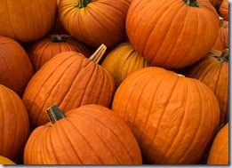
With the cooler weather upon us and the occasion of Halloween just past, I thought it would be fun to do a post about the colour ORANGE Up here in the eastern part of Canada, we have an abundance of ORANGE this time of the year (well we did a week or so ago…).
Pumpkins, mums and a multitude of colourful leaves (that need raking – sigh…) from trees and plants that are getting ready for their winters rest.
Sometimes I wish I could do the same –
But I digress … I have been struggling with ORANGE in my own home for some time – remember my post about the colour BLUE and how it was my favourite colour and that my dining room would be painted BLUE regardless of the mood created. Well, if BLUE is my favourite colour, ORANGE is a close second.
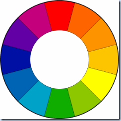
If you read Kelly’s post on DesignTies this week you’d see that they are opposites on the colour wheel, so not a coincidence apparently. My struggle is that I love the deeper darker oranges – along the rusty lines – and would love to have this colour in my dining room too – but two distinctly different moods would be created – one a fresh, clean, light mood with the BLUE – and the other a warm, spicy, tropical mood with the rusty ORANGE.
So to help in this decision I decided to do a little research into ORANGE.
Some history on the colour name found on Wikipedia – ORANGE is named after the orange fruit,
but before the first recorded use of ORANGE as a colour (court of King Henry VIII in 1512) the colour was referred to as “geoluhread” which means yellow-red.
On the colour wheel, ORANGE is between yellow and red and is opposite and complementary to BLUE (yeah BLUE)!
In North America, the Engineering field uses ORANGE for it’s academic dress. ORANGE is the national colour of the Netherlands, which dates back to the name of their royal family - Orange-Nassau – who used to own the principality of ORANGE. The colour continues to be significant in modern day Dutch society, with many national sports teams sporting ORANGE uniforms. Most geographical uses of ORANGE can be traced back to 17th century Dutch mariners. Ireland’s use of the word ORANGE is traced back to William of ORANGE the English King, the grandson of William the Silent a Dutch head of state.
ORANGE can be found on the national flags of Ireland, India, Niger and Cote d’Ivoire. ORANGE is the official colour of many political parties throughout the world and has religious connotations for Hindus. Deluxe International ORANGE is the colour of San Francisco’s Golden Gate Bridge:
The word ORANGE is one of the few words in the English language that doesn’t rhyme with anything – try it ….
Of course ORANGE and black are the colours of our recently celebrated Hallowe’en – mainly because pumpkins are ORANGE and the night is black … mwaah haaa haaa haaa
In decorating, ORANGE denotes energy and warmth, but is slightly less aggressive than red due to the yellow cheerfulness. ORANGE is a warm colour and can stimulate emotions, activity and the appetite. ORANGE also encourages socialization. Even so, ORANGE is one of the most controversial colours and usually sparks immediate reactions in people who either “love it” or “hate it” – more so than any other colour.
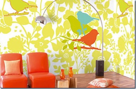
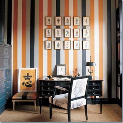
Let’s have look at some rooms that have used ORANGE …
(Well – this is too weird, as I’m writing this I’m watching Jane Lockhart paint a room ORANGE …. eerie huh?)
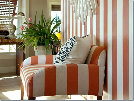
Now this is the “ORANGE” I’m thinking of for my dining room ---
How about some ORANGE furniture?
(Carl Chaffee Orange Slice Table – 1stdibs.com)
Some ORANGE artwork…
Some ORANGE accessories …
I can see myself carrying this bag …
(Olivia Harris Zip Tote – www.luxeist.com)
Driving THIS Car …un-huh –that’s what I”m talkin’ about!
(Orange Porsche – www.Amitkulkarni.info)
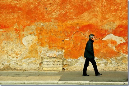
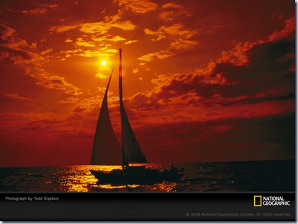
And finally some ORANGE scenery …
Well, I don’t think that helped at all - now I’m really struggling with my ORANGE vs BLUE decision …
What do you think?












soooo loving the ORANGE!!!
ReplyDeleteThanks for the shout-out :-)
ReplyDeleteYou found some great orange pictures. Love that literally orange table from 1stdibs!!
Seeing as you've painted your DR table a dark black-brown, I think you should paint your walls the dark rusty orange that you like. And then rather than a light blue, you could use a slate blue to go with the rust colour. C&M has a great fabric that would be perfect for that colour scheme. It's the same fabric I used to re-cover the chair in our guest bedroom, but the colourway is copper & steely blue. I might have a sample of it around here somewhere...
Kelly
Go check out Cobi Ladner's latest blog post -- I think you'll be able to decide which way to go with your DR :-)
ReplyDeleteAdd Spice with Pumpkin
Kelly
Wow!!
ReplyDeleteWonderful Post!!
So many beautiful images....
Have a super weekend!
xo Laura
I definitely understand your delimma. I love the color orange as well - finding a good medium is important for design. I've thought about temporarily sticking orange design stickers on the walls - maybe something artsy?
ReplyDeleteI ADORE ORANGE, YOU DID GOOD!!
ReplyDelete